Evaluation
On my magazine cover I chose to focus on the models to associate with Wyke rather than my background. Originally I was going to use three people, because I would of liked three Wyke hoodies, unfortunately I couldn’t get hold of three different hoodies so I had to use two people. At first I was going to have the models both facing the wall, but as the red hoodie didn’t say ‘name of subject’ at Wyke, or include the name of the college, as it just said Dance, I decided to show the front logo on the hoodie for the college. When taking the photos i wanted a plain background so i could cut out the models and put a completely different background behind the models in photoshop. After taking photos off the models facing the wall, i decided to try taking photos of them outside which i thought didn't look good at all. I wanted the background to be separate to the models but not anything to do with Wyke, so i chose to take a simple picture of the sky. I thought that the background could of done with being lighted up on photoshop as it looks abit dull, but i had realised this last minute so could not adjust the idea. The magazine name ‘Inside at Wyke’ which I thought was appropriate, as because on some of the Wyke hoodies, it says ‘nameofsubject@wyke’ and it suited what was on the cover, even though it took a lot of thinking what to call it. The positioning of the models arms/hands was quite difficult to think what to do with them, eventually i made them put them in their pockets because i wanted them to look casual. The font i used for the masthead and subheadings was from the site http://www.dafont.com/, the reason why i kept the masthead and subheadings the same font is because if i used three different fonts it may have looked out of place and not very good also the font for the description under the subheadings was Hobo Std from photoshop. I think also that there isn't enough on the cover, that there is too much space, and more subheadings are needed. Too make it more interesting i should of maybe overlapped the writing onto the pictures or changed the colour of the font.
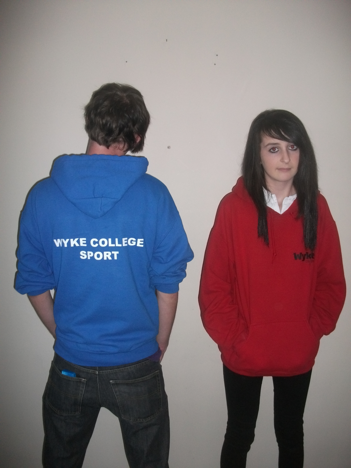
Before starting the front cover, i took a fair few pictures, which i only ended up using two, these are the pictures i didn't use:

I didn't use this this picture because it was taken outside and i was just trying out different places were i could of taken the photo.

I didn't use this photo because on the blue hoodie part of the model's sleeve is cut off.

This photo also wasn't used because one of my model's accidentally smiled.

This photo looks identical to the one i used on my front cover but it is still a different picture.


These pictures weren't used because it was only one model, and the pose is too casual for the magazine, this was just my experimenting in which photo looks the best.

I didn't use this picture because it was landscape and my front cover is portrait.
At first on the magazine i decided to put a bar code on it, it wasn't later through the process of designing the cover was that i don't need one as the college magazine would be free.
Through making this project, we had to post various things on http://www.blogger.com/ so that we don't have to print everything off. Overall i think the project went quite well and it went better than i thought it would.
Through making this project, we had to post various things on http://www.blogger.com/ so that we don't have to print everything off. Overall i think the project went quite well and it went better than i thought it would.


