For my magazine I decided I wanted to do a magazine along the lines of ‘Kerrang’ using the same sort of genre. My front cover has the same conventions of most magazines. In every magazine there is a masthead, barcode, issue number, what is featured inside and a price. Also I made a banner for the featured band to show what the most important band, the magazine is about for that week. At first the band’s name was positioned differently so that the name on my band member’s t-shirt looked like he was prompting a different band because of the way he was posing. I changed this so the band name on the t-shirt is hidden and his pose now looks as if he’s telling people to read about his band. I chose to call my magazine ‘Underground’ because quite a lot of small venues tend to play this kind of music. In each week of the magazine there are 2 free giant posters, if the audience do not like the featured band, the posters may encourage them to buy the magazine as they may use them to decorate a room of theirs, which posters are used for. Different bands are included in different issues of the magazine, if I didn’t advertise the bands that are going to be in it, people may not buy it might not be a very good issue.
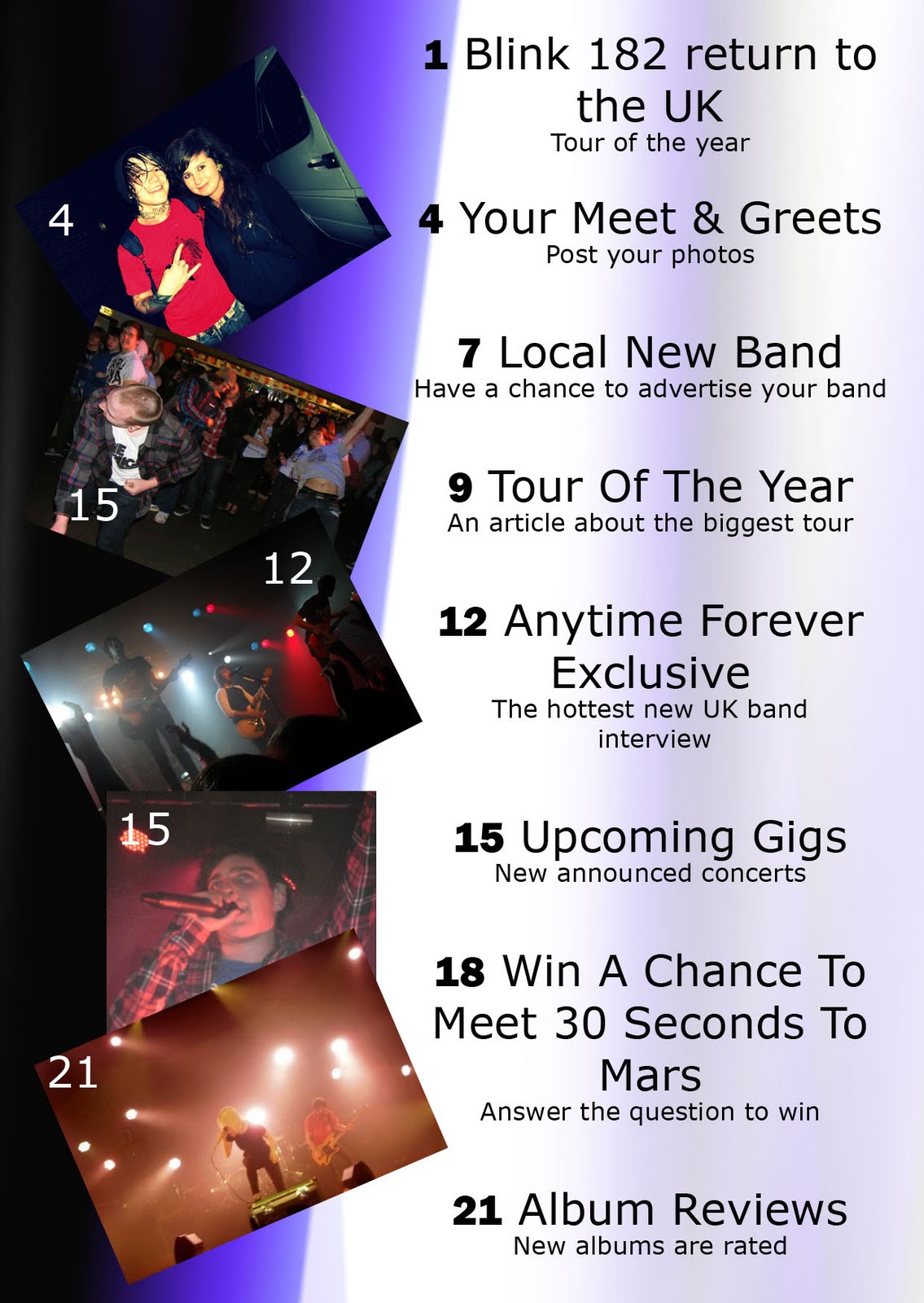
My contents page is like other magazines as it has pictures telling you which number page that information will be on. Also it has pages that would be in the magazine every week, a different new featured band every week and pages that may only appear once every few weeks. Underneath the names of the pages there is a description of what will include in the page. I made the photos look as if they had been collaged as I know that people cut pictures and posters out of magazine to collage their bedroom walls.
In my double page spread I have shown were you can find information and download music for the band. Also it gives you information about the band like age, name and were they come from. Throughout my magazine I have used a house style colour which is purple/blue, white and black. My genre of music which is metal, post – hardcore may associate with these dark colours.
My magazine represents particular social groups by focusing on a few genres that are related, alternative rock music, as this includes all different type of rock/metal genres such as punk, metal core, grind core, mathcore, hardcore, post-hardcore and rock/metal itself. Stereotypically people that would be interested in this magazine would be people who like this music such as ’emo’s’, ‘goths’, ‘HxC’ and maybe people who are wanting to start a band concentrating on this genre.
I think that Bauer, a publishing house may want to distribute this product because there is a lack of magazines in this genre and it has a range of different sub-genres.
The audience for my magazine is for male and females, and the age group would be 15 - 24. People who would by this magazine would be the ones who are unemployed or Semi-skilled manual workers, and unskilled manual workers.
I think the main attraction on my front cover is the Masthead, because it is colourful and it’s the main convention that stands out. Also the sub-heading of the band is black and white which is what people may look at secondly. Also when they look at the sub-heading they may possibly like the band which will make them buy the magazine. To address my audience I used models that were aged between 15 and 24 because if they were younger it may look too young for them and older men it may be too older for them, even though that some bands are older. I think that the free giant posters may encourage people to buy the magazine if they don’t like the featured band.
I have learnt how to use a few new technologies throughout creating this magazine. The first technology is photoshop. Before making this magazine I had no idea how to use this and it was a struggle to get used to know how to use it, before this music magazine text we had to do a preliminary task which then taught me how to use it. Secondly when changing each thing on my magazine we had to post it on a blog, this task has also taught me how to use a blog. At the beginning of the task we had to take photos, using a camera which improved my camera skills. I took quite a lot of new photos, but also used a lot of photos from the past year which I had took at music concerts which was quite convenient.
Looking back at my preliminary task I feel I have progressed a lot. I think I have made a magazine appropriate to my target audience. Although I still don’t know how to use all the tools on photoshop I feel that I can now use photoshop better, and have used blogger to post a lot more than I did with the last task. In my preliminary task I didn’t use my time well, whereas this time I used my time very well to ensure I would get this finished. In my preliminary task the background of my cover had nothing to do with the first magazine whereas in this task I made sure there was a purpose of it being blacked.
I have asked a student from Wyke, Jack Fisher, to evaluate my magazine and give his opinion on my work.
- I think your mast head really stands out
- I think the layout of your double page spread is good
- I like the house style colour throughout the magazine
I asked another student from Wyke, Rachel Huckin, to evaluate my magazine and give her opinion on my work.
- I think the choice of your page titles are good
- I like the way your contents page looks like a collage of photos
- I like your album art
I asked a third student from Wyke, Katie Thompson, to evaluate my magazine and giver her opinion on my work.
- I like the way the subheading is black and white
- I like the way how the photos on the contents page are linked to the page titles
- Also the house style colour throughout the magazine